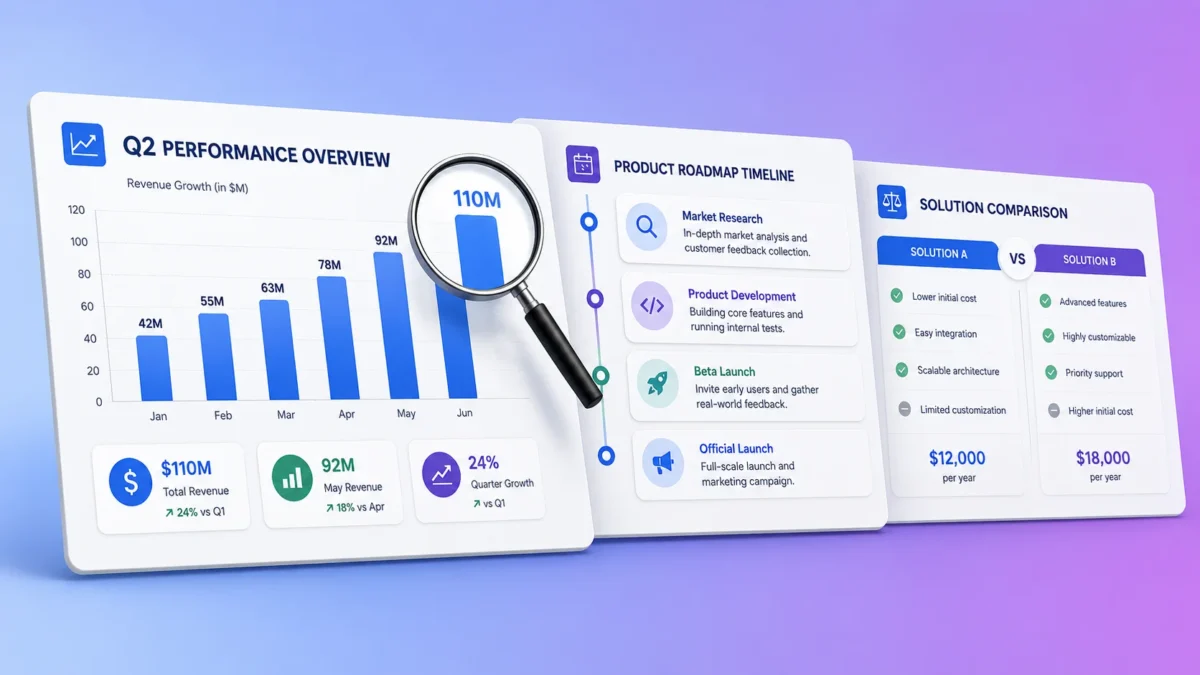
Most AI image models still turn text into scrambled shapes. Nano Banana 2 does not, and that single change makes it the first image model that can produce a usable infographic on the first try.
This library gives you 40 nano banana 2 infographic prompts you can copy, paste and run today, organized by the format you actually need: data charts, timelines, comparison tables, process flows, stats cards, roadmaps and video summaries. Five of them were run and captured before publication, and the outputs appear in this article exactly as the model produced them, including one that got the numbers badly wrong.
That last point matters more than the prompt list. Nano Banana 2 will build you a beautiful chart full of invented figures and put a real research firm’s name at the bottom of it. Knowing where the line sits between what it does well and what it fabricates is the difference between a visual that helps you and one that damages your credibility.
What Nano Banana 2 changes for infographics
Nano Banana 2 is Google’s image model released on February 26, 2026, officially named Gemini 3.1 Flash Image. It matters for infographics because it combines legible text rendering with layout reasoning, which no earlier image model did well at the same time.
According to Google’s launch announcement, the model draws on Gemini’s real world knowledge base and is powered by real time information and images from web search to render specific subjects more accurately, and Google states directly that this understanding helps users create infographics, turn notes into diagrams and generate data visualizations.
Google’s DeepMind model page for Gemini Image positions the model as offering pro level generation and editing at Flash speed, and the Gemini API documentation confirms the underlying capabilities: advanced text rendering capable of producing legible, stylized text for infographics, menus, diagrams and marketing assets, output resolutions from 512 pixels up to 4K, and grounding with Google Search available as a tool for generating imagery based on real time data.
Three practical consequences follow from that, and they shape every prompt in this library.
Text inside the image is now reliable at large sizes. Headlines, section labels and step names come out clean and correctly spelled. Layout instructions are followed closely. If you specify a two column comparison with six rows, you get a two column comparison with six rows. And factual content is not reliable, regardless of how confident the output looks.
If you are new to how these models work, our guide to generative AI fundamentals covers the mechanics behind that last limitation.
How we verified these nano banana 2 infographic prompts
Transparency about method matters here, because most prompt libraries claim testing that never happened. Here is exactly what was and was not verified.
Five prompts from this library were run in the Gemini app before publication and their outputs are reproduced in this article without editing, retouching or cherry picking. Those five cover the capabilities the rest of the library depends on: search grounded data output, the two step text workflow, extreme vertical formats, video input, and multilingual editing. Where a prompt failed or produced errors, the failure is shown rather than hidden.
The remaining 35 nano banana 2 infographic prompts are built directly on documented model capabilities from Google’s official developer documentation and launch materials rather than on individual test runs. They follow the same structural patterns that the verified five confirmed, but each specific output has not been individually captured.
This article was written and the outputs assessed by Ahmad Hussain, ACCA. That is relevant because the most important finding below concerns fabricated financial and market data, and recognizing a wrong market share figure requires knowing what the right one looks like.
The two step text rule that fixes most broken infographics
The single highest impact technique in this entire library is not a prompt at all. It is a sequence. Google’s own documentation states that when generating text for an image, Gemini works best if you first generate the text and then ask for an image with that text.
Almost nobody does this. Most people write one long prompt describing both the content and the design, and the model has to invent the wording and lay it out simultaneously. Splitting those two jobs produces dramatically better results, and it lifts the output quality of every one of the nano banana 2 infographic prompts that follow.
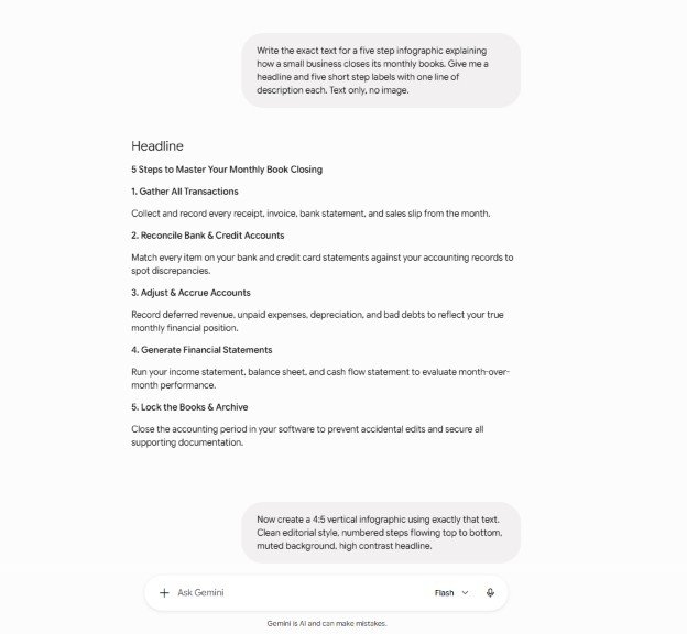
Here is the verified example. The first message asked only for text, with no image.
Write the exact text for a five step infographic explaining how a small business closes its monthly books. Give me a headline and five short step labels with one line of description each. Text only, no image.
Gemini returned a headline reading “5 Steps to Master Your Monthly Book Closing” and five labeled steps covering gathering transactions, reconciling accounts, adjusting and accruing, generating financial statements, and locking the books.
The second message, sent in the same chat, requested the image.
Now create a 4:5 vertical infographic using exactly that text. Clean editorial style, numbered steps flowing top to bottom, muted background, high contrast headline.
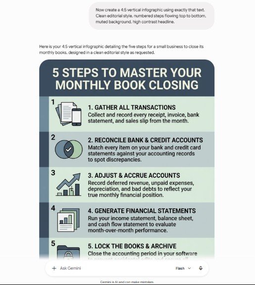
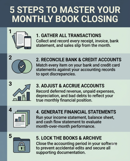
The result matched the approved text word for word across the headline and all five steps, with no spelling errors and the requested vertical ratio. That fidelity is what makes the technique worth adopting for anything where the wording matters.
One defect appeared. The output numbered each step twice, once in a left hand numeral column and again inside the label itself. The fix is to add “do not repeat the step numbers inside the labels” to the second message.
Apply this two step pattern to any prompt below where the text must be exact. It is especially valuable for finance and reporting visuals, the same territory covered in our ChatGPT prompts for accountants library.
Data and chart nano banana 2 infographic prompts
These nano banana 2 infographic prompts produce chart based visuals. Read the accuracy warning further down before using any of them with figures you have not supplied yourself. The reliable pattern is to paste your own verified numbers into the prompt rather than asking the model to retrieve them.
Prompt 1: Horizontal bar chart with your own data
Create a 16:9 infographic with a horizontal bar chart using exactly these figures and no others: [PASTE YOUR DATA]. One bold headline at the top, clean modern flat design, a single accent color with grey supporting bars, value labels at the end of each bar, and a source line at the bottom reading [YOUR SOURCE]. Legible sans serif text. Do not add or estimate any figures.
Prompt 2: Donut chart breakdown
Create a 1:1 infographic featuring a donut chart showing this breakdown: [PASTE YOUR CATEGORIES AND PERCENTAGES]. Place the total in the center of the donut. Legend on the right with color swatches and percentage values. Muted professional palette, generous white space, one headline above the chart.
Prompt 3: Year over year comparison columns
Create a 16:9 infographic comparing [METRIC] across [YEAR A] and [YEAR B] using paired vertical columns for these values: [PASTE VALUES]. Show the percentage change as a callout above each pair. Clean corporate style, two color palette, gridlines subtle, axis labels legible.
Prompt 4: Single big number stat
Create a 4:5 infographic built around one enormous number: [YOUR FIGURE]. The number fills the upper half in heavy bold type. Below it, one line of context in smaller text reading [YOUR CONTEXT LINE], then a thin source line. Bold single color background, high contrast typography, no illustrations.
Prompt 5: Multi metric dashboard card
Create a 16:9 infographic laid out as a dashboard with four metric cards in a 2 by 2 grid. Card contents: [PASTE FOUR METRICS WITH VALUES]. Each card has an icon, a large value, a label, and a small trend indicator. Consistent card sizing, soft shadows, restrained palette of one accent color plus greys.
Prompt 6: Ranked leaderboard
Create a 4:5 infographic showing a ranked list of [TOPIC] using exactly this order and these values: [PASTE RANKED LIST]. Number each row from one downward, use a bar or badge to show relative size, keep row heights identical, and place the headline in a contrasting band across the top.
Timeline nano banana 2 infographic prompts
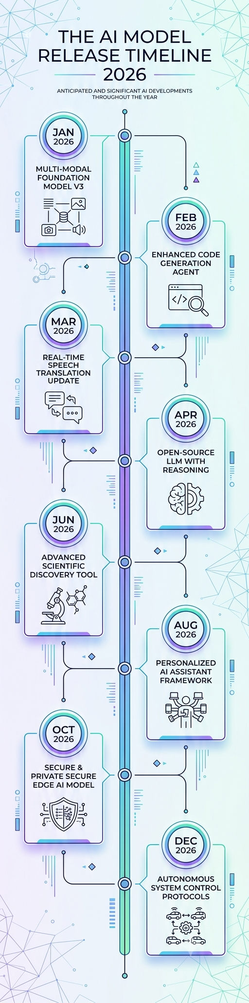
Timelines are where Nano Banana 2’s layout reasoning shows best, and where its factual invention shows worst. Supply your own milestones. The nano banana 2 infographic prompts in this section all leave a placeholder for exactly that reason, and the verified example below demonstrates both sides of the pattern at once.
The tall format prompt was run before publication and produced a genuinely long vertical image with eight milestones arranged down a central spine, alternating left and right exactly as instructed. The layout execution was excellent. Every single milestone was fabricated, and one label repeated a word, reading “secure and private secure edge AI model.”
Prompt 7: Vertical spine timeline, long form
Create a 1:4 vertical long form infographic titled "[YOUR TITLE]". Place these milestones down a central vertical spine, alternating left and right: [PASTE YOUR DATED MILESTONES]. Each milestone has a date badge and a one line label. Minimal line art icons. High resolution. Use only the milestones provided and invent nothing.
Prompt 8: Horizontal roadmap timeline
Create a 16:9 infographic showing a left to right horizontal timeline with these five stages: [PASTE STAGES WITH DATES]. A single horizontal line runs through the center with alternating labels above and below. Rounded date markers on the line, thin connector stems, muted palette with one accent color.
Prompt 9: Quarterly plan timeline
Create a 3:2 infographic showing four quarters across the page, labeled Q1 to Q4, with these deliverables in each: [PASTE DELIVERABLES]. Each quarter is a vertical column with a colored header band and a bulleted list beneath. Consistent column widths, legible body text, professional corporate style.
Prompt 10: Company history timeline
Create a 4:5 vertical infographic telling the history of [ORGANIZATION] using exactly these dated events: [PASTE EVENTS]. Zigzag layout down the page with year circles, short event titles and one line descriptions. Warm editorial palette, thin connecting line, simple icons.
Prompt 11: Before and after transformation timeline
Create a 16:9 infographic split into a before state on the left and an after state on the right, connected by a central arrow. Before state contents: [PASTE]. After state contents: [PASTE]. Use a cool muted palette on the left and a brighter palette on the right to signal improvement. Clear labels on both halves.
Prompt 12: Process timeline with durations
Create a 3:2 infographic showing a sequential process with these steps and durations: [PASTE STEPS AND TIMINGS]. Represent each step as a horizontal bar whose length is proportional to its duration, stacked vertically and labeled on the left. Include a total duration callout. Clean flat design, legible numerals.
Comparison nano banana 2 infographic prompts
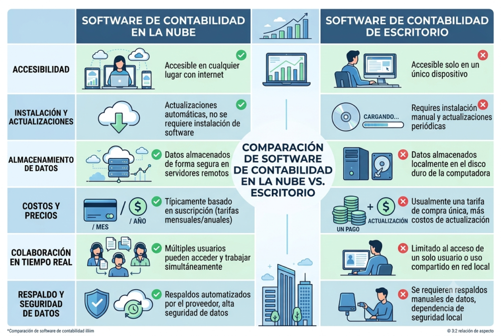
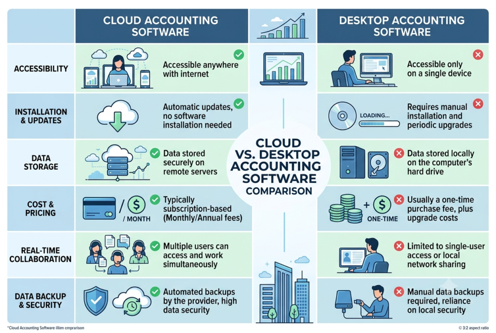
Comparison layouts were the strongest verified result. The tested prompt produced a clean two column table with six rows, distinct column headers and check and cross icons throughout, and a follow up translation request preserved the entire layout while converting every label to Spanish. Layout, colors and icon positions all survived the edit, which makes these among the most dependable nano banana 2 infographic prompts in the library.
Prompt 13: Two column feature comparison
Create a 3:2 side by side comparison infographic for [OPTION A] versus [OPTION B]. Two columns, six comparison rows covering [PASTE YOUR SIX CRITERIA], clear column headers, check and cross icons, restrained two color palette, all text legible.
Prompt 14: Three way comparison
Create a 16:9 infographic comparing three options: [A], [B] and [C], across these five criteria: [PASTE CRITERIA]. Three equal columns with header bands, criteria labels down the left, and short value text in each cell. Highlight the recommended column with a subtle border. Keep every cell aligned to a strict grid.
Prompt 15: Pros and cons split
Create a 4:5 infographic split vertically into pros on the left and cons on the right for [TOPIC]. Pros: [PASTE]. Cons: [PASTE]. Green accent on the left, muted red on the right, matching icon style on both sides, equal item counts, headline across the top.
Prompt 16: Pricing tier comparison
Create a 16:9 infographic comparing three pricing tiers named [PASTE TIER NAMES] with these prices and features: [PASTE DETAILS]. Three cards side by side, the middle card slightly elevated and marked as most popular, feature lists with check icons, prices in large bold type.
Prompt 17: Old way versus new way
Create a 3:2 infographic contrasting the traditional approach to [TASK] against the modern approach. Traditional: [PASTE]. Modern: [PASTE]. Left half in desaturated tones with dated iconography, right half in bright tones with clean modern icons, divided by a vertical rule.
Prompt 18: Multilingual comparison follow up
Translate all text in this infographic to [LANGUAGE]. Do not change the layout, colors, or any other element.
That last prompt is a follow up message sent in the same chat immediately after a comparison image is generated. In testing it preserved the source layout completely, which makes it a genuinely useful way to produce localized versions of the same asset. Watch for text overflow in languages with longer words.
Process and flow nano banana 2 infographic prompts
Process diagrams reward precise structural instructions, so the nano banana 2 infographic prompts below specify shape, direction and connector style rather than leaving those choices to the model.
Prompt 19: Numbered step process
Create a 4:5 vertical infographic showing a [NUMBER] step process for [TASK], using exactly these steps: [PASTE STEPS]. Numbered circles down the left, step titles in bold, one line descriptions beneath, alternating row background shading. Do not repeat the step numbers inside the labels.
Prompt 20: Circular cycle diagram
Create a 1:1 infographic showing [FRAMEWORK] as a continuous cycle with these stages: [PASTE STAGES]. Arrange the stages evenly around a circle with curved arrows indicating clockwise flow, the framework name in the center, and one icon per stage. Flat vector style, five color palette.
Prompt 21: Decision tree flowchart
Create a 4:5 infographic showing a decision flowchart for [DECISION]. Start with this question at the top: [PASTE]. Branch into yes and no paths with these outcomes: [PASTE BRANCHES]. Diamond shapes for decisions, rounded rectangles for outcomes, clean connector lines with arrowheads, generous spacing.
Prompt 22: Funnel diagram
Create a 4:5 infographic showing a funnel with these stages from widest to narrowest: [PASTE STAGES WITH VALUES]. Each band labeled inside with the stage name and figure, decreasing width top to bottom, gradient from a light tone at the top to a saturated tone at the bottom.
Prompt 23: Swimlane workflow
Create a 16:9 infographic showing a workflow across three swimlanes labeled [PASTE LANE NAMES]. Steps in each lane: [PASTE STEPS]. Horizontal lanes with labeled headers on the left, steps as rounded boxes connected by arrows that cross lanes where handoffs occur. Muted professional palette.
Prompt 24: Checklist infographic
Create a 4:5 infographic laid out as a checklist for [TOPIC] with these items: [PASTE ITEMS]. Stylized clipboard or document background, empty checkboxes on the left, item text in a clean sans serif, clear separation between items, handwritten style header.
Stats card and social nano banana 2 infographic prompts
These formats are built for social feeds rather than long reading. Rich color and strong contrast matter more here than restraint, which is a different design brief from the reporting visuals above. The nano banana 2 infographic prompts in this group therefore lean brighter and bolder than the reporting formats above. Our roundup of AI tools for marketing covers where these fit in a wider content workflow.
Prompt 25: Instagram stat card
Create a 4:5 infographic optimized for social feeds featuring this single statistic: [PASTE STAT]. Enormous numeral occupying the upper two thirds, short context line beneath, bold saturated background color, high contrast white typography, small attribution line at the bottom.
Prompt 26: Carousel style tip card
Create a 1:1 infographic presenting one tip about [TOPIC]. Tip text: [PASTE]. Large bold headline, supporting sentence beneath, one simple line illustration on the right, strong two color palette, generous margins suitable for a social carousel slide.
Prompt 27: Quote card
Create a 1:1 infographic featuring this quotation: [PASTE QUOTE], attributed to [NAME AND ROLE]. Large serif type for the quote, oversized opening quotation mark as a background element, attribution in small caps beneath, muted single color background.
Prompt 28: Myth versus fact card
Create a 4:5 infographic with a myth on top and the fact below. Myth: [PASTE]. Fact: [PASTE]. Myth section in a muted red band with a cross icon, fact section in a green band with a check icon, bold sans serif type, clear visual separation between the two halves.
Prompt 29: Bento grid summary
Create a 1:1 infographic laid out as a bento grid with five unequal panels covering these points: [PASTE POINTS]. Vary panel sizes for visual interest, one panel dominant, rounded corners on every panel, consistent internal padding, cohesive palette of three colors.
Prompt 30: Icon grid overview
Create a 16:9 infographic showing six items as an icon grid: [PASTE ITEMS]. Each cell contains one simple line icon above a short bold label and a one line description. Three columns by two rows, identical cell dimensions, monochrome icons with a single accent color.
Roadmap and org chart nano banana 2 infographic prompts
Hierarchical layouts are the most structurally demanding format here, so these nano banana 2 infographic prompts spell out box sizing, connector behavior and column arrangement explicitly.
Prompt 31: Product roadmap
Create a 16:9 infographic showing a product roadmap across three horizons labeled Now, Next and Later, containing these items: [PASTE ITEMS BY HORIZON]. Three vertical columns with distinct header colors, items as stacked cards within each column, small tag labels on each card.
Prompt 32: Organizational chart
Create a 3:2 infographic showing an organizational chart with this structure: [PASTE ROLES AND REPORTING LINES]. Top level box centered, connector lines branching downward to subordinate boxes, consistent box sizing, role titles in bold with names beneath, clean corporate palette.
Prompt 33: Team structure overview
Create a 16:9 infographic showing [NUMBER] teams and their responsibilities: [PASTE TEAMS AND RESPONSIBILITIES]. Each team as a labeled panel with an icon, a headcount figure and a bulleted responsibility list. Equal panel widths, unified color system with one hue per team.
Prompt 34: Maturity model ladder
Create a 4:5 infographic showing a maturity model with these ascending levels: [PASTE LEVELS]. Represent as ascending steps climbing left to right, each step labeled with the level name and a short description, gradient deepening as the steps rise, small icon on each step.
Prompt 35: Strategy framework grid
Create a 1:1 infographic showing a two by two strategy matrix. Axis labels: [PASTE X AND Y AXIS LABELS]. Quadrant contents: [PASTE FOUR QUADRANTS]. Distinct background tint per quadrant, quadrant titles in bold with a one line description beneath, clean axis lines with arrowheads.
Video to infographic nano banana 2 infographic prompts
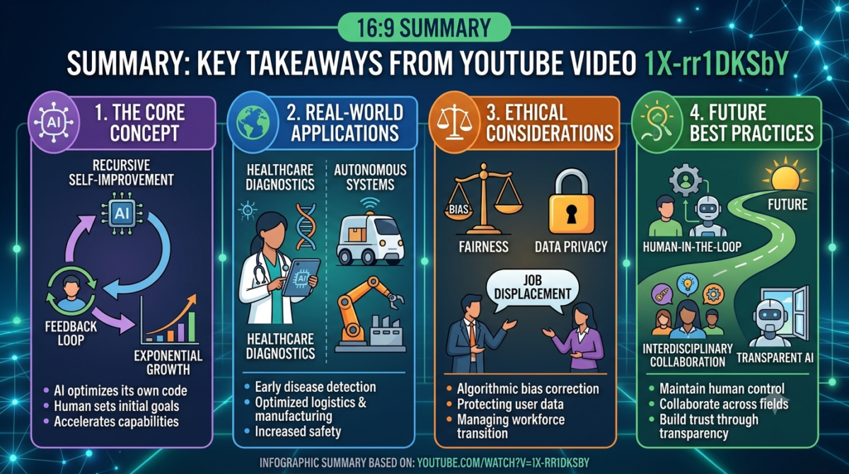
This capability is specific to Nano Banana 2. The Gemini API documentation states that video to image generation is available only on the Gemini 3.1 Flash Image model, and that it can produce summary infographics from a YouTube URL or an uploaded video by analyzing frames in context.
Verified behavior matters here. The first attempt returned a text summary instead of an image. Switching the Gemini app into image mode before sending the request produced the infographic successfully on the second attempt. If you paste a video link and get an essay back, that is why. The nano banana 2 infographic prompts in this section all open with an explicit image instruction for the same reason.
One cosmetic flaw appeared in the output: the model printed the raw video ID inside the headline. Prompt 36 below includes wording to prevent that.
Prompt 36: Video summary infographic
Generate an image, not text. Create a 16:9 summary infographic capturing the key points of this video: [PASTE YOUTUBE URL]. One headline and four labeled sections. Do not include the video ID or URL anywhere in the headline. Clean flat design, legible sans serif text.
Prompt 37: Video to key takeaways card
Generate an image, not text. Create a 4:5 infographic listing the five most important takeaways from this video: [PASTE YOUTUBE URL]. Numbered list format, short punchy phrasing, bold headline at the top, single accent color, no video ID in any text.
Prompt 38: Video to process diagram
Generate an image, not text. Watch this video and create a 16:9 process diagram of the method it describes: [PASTE YOUTUBE URL]. Sequential steps connected by arrows, each step labeled with a short verb phrase, minimal iconography, clean professional style.
Prompt 39: Video thumbnail concept
Generate an image, not text. Create a 16:9 thumbnail concept based on the themes of this video: [PASTE YOUTUBE URL]. One short punchy phrase of no more than five words in very large type, strong focal image, high contrast saturated colors, no small text anywhere.
Prompt 40: Video to comparison card
Generate an image, not text. This video compares two approaches. Create a 3:2 side by side comparison infographic summarizing them: [PASTE YOUTUBE URL]. Two columns with headers, four comparison rows, check and cross icons, restrained two color palette.
Why you should never trust the numbers Nano Banana 2 generates
This is the finding that should change how you use every prompt above. Nano Banana 2 will produce a professional looking data visualization containing incorrect figures and attach the name of a real research firm to them.
The tested prompt asked for a chart of current global cloud market share, explicitly instructing the model to search for the most recent 2026 figures before generating. The output was clean, well laid out and entirely convincing. It showed Amazon Web Services at 30.0 percent, Microsoft Azure at 25.0 percent, Google Cloud at 13.0 percent, Alibaba Cloud at 4.0 percent and Oracle Cloud at 3.0 percent, with a source line crediting Synergy Research Group Q1 2026 data and Gartner.
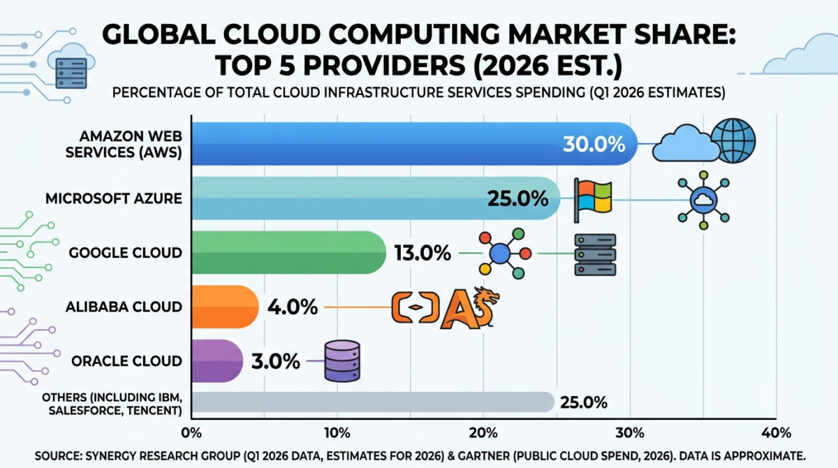
Those figures do not match what Synergy Research Group published. Statista, which reproduces Synergy’s chart under licence, reports Amazon at 28 percent of the worldwide cloud infrastructure market in the first quarter of 2026, Microsoft Azure at 21 percent and Google Cloud at 14 percent, with total quarterly spending of 129 billion dollars.
The gap is material. The generated chart overstates AWS by two points and Azure by four, and puts the three largest providers at a combined 68 percent against the 63 percent that Synergy actually reported. A named research firm was credited for numbers it did not publish.
Two further defects appeared in the same image. The Microsoft row used an outdated Windows flag rather than the Azure mark, and the Alibaba Cloud logo rendered as garbled lettering. Brand marks are not reliable in generated output, which also carries trademark implications if you publish the result commercially. The model is now generally available through Google Cloud for enterprise workflows, which makes that caution more relevant, not less.
There was no visible search indicator and no source citations anywhere in the conversation, so there is no evidence that grounding actually ran despite the prompt requesting it.
The practical rule is simple. Use Nano Banana 2 as a designer, never as a researcher. Verify every figure yourself, paste your verified numbers directly into the prompt, and instruct the model explicitly not to add or estimate anything. Notably, Google’s own positioning supports this caution: the launch announcement recommends Nano Banana Pro for high fidelity tasks requiring maximum factual accuracy, while positioning Nano Banana 2 for rapid generation and instruction following.
If your work involves reporting figures that must be defensible, the same discipline applies as in any spreadsheet and financial reporting workflow. The model builds the container. You supply the contents.
Fixing common Nano Banana 2 infographic problems
Testing surfaced a consistent set of failure patterns that affect every one of these nano banana 2 infographic prompts. Each has a prompt level fix.
Small text turns into gibberish
Large text renders cleanly. Footnotes, source lines and captions frequently degrade into nonsense characters. In one tested output the footer read as scrambled letters while every headline and label on the same image was perfect.
The fix is to avoid small text entirely. Request no text below a certain visual weight, keep source lines short, and plan to add fine print yourself afterwards in a design tool.
The model invents facts you did not supply
Any gap you leave gets filled with plausible fabrication. A timeline request without supplied milestones returned eight invented product releases.
The fix is to include the instruction “use only the information provided and invent nothing” in every prompt where accuracy matters, and to paste your content rather than describing it.
Step numbers appear twice
Numbered layouts often render a numeral column alongside numbers already inside the labels.
The fix is to add “do not repeat the step numbers inside the labels” to the prompt.
A video link returns text instead of an image
The Gemini app defaults to summarizing rather than generating when it receives a video URL.
The fix is to switch the app into image mode before sending, and to open the prompt with “generate an image, not text.”
The output describes something different from what it drew
In one tested comparison, the chat response listed six categories that did not match the six categories actually rendered in the image. Trust the image, not the description beside it.
Logos and brand marks come out wrong
Expect outdated or distorted brand imagery. Ask for generic icons instead of company logos, or leave space and add real logos yourself.
Frequently asked questions
What are the best nano banana 2 infographic prompts for beginners?
Start with Prompt 19, the numbered step process, and Prompt 13, the two column comparison. Both use simple structures the model handles reliably, and both let you paste your own content so accuracy stays under your control. Once those work consistently, move on to the two step text technique described earlier, which improves results across every other format in this library.
Can Nano Banana 2 create infographics with accurate real world data?
No, not reliably. In testing, a prompt explicitly requesting current 2026 figures returned a chart overstating two major providers by two and four percentage points respectively, while crediting a research firm that published different numbers. Google itself positions Nano Banana Pro rather than Nano Banana 2 for tasks requiring maximum factual accuracy. Always supply verified figures yourself and instruct the model not to estimate.
What aspect ratios work best for infographics in Nano Banana 2?
The Gemini API documentation lists a wide range including 1:1, 4:5, 3:4, 2:3, 3:2, 16:9, 9:16 and extreme ratios such as 1:4 and 1:8. Use 4:5 or 1:1 for social feeds, 16:9 or 3:2 for presentations and articles, and 1:4 for long form scrolling infographics. Extreme vertical ratios worked in testing and produce genuinely tall output.
Why does the text in my Nano Banana 2 infographic look scrambled?
Small text is the usual cause. Headlines and section labels render cleanly, but footnotes, source lines and captions frequently degrade into unreadable characters. Reduce the amount of fine print in your prompt, keep any required small text short, and add captions or attributions yourself afterwards using a design tool rather than asking the model to render them.
Can Nano Banana 2 turn a YouTube video into an infographic?
Yes. Video to image generation is available specifically on the Gemini 3.1 Flash Image model, and it can generate summary infographics from a YouTube URL. In testing, the first attempt returned a text summary instead of an image, and switching the Gemini app into image mode before resending produced the infographic successfully. Opening your prompt with “generate an image, not text” helps avoid the issue.
Do these nano banana 2 infographic prompts work in other tools?
The prompt structures transfer reasonably well to other image models, but the results will not match. The specific strengths these prompts rely on, particularly legible text rendering at scale and close adherence to layout instructions, are what distinguish this model. Prompts requesting video input or extreme aspect ratios are unlikely to work elsewhere at all.
Getting the most from these prompts
The 40 nano banana 2 infographic prompts in this library share one underlying principle: the model is an excellent designer and an unreliable researcher. Every prompt that succeeded in testing succeeded because the structure was specified precisely. Every prompt that failed did so because the model was left to supply facts.
Work that way and these nano banana 2 infographic prompts produce genuinely usable results. Specify the format, the ratio, the palette and the layout in detail. Paste your own verified content rather than describing what you want the model to find. Split text generation from image generation whenever the wording matters. Keep small text to a minimum and add fine print yourself.
For more prompt libraries across different tools and use cases, browse our AI Prompts Library, or explore the full AI Insights Hub for guides and analysis. If you want to see how fast this space is moving, our monthly roundup of the biggest AI developments tracks each release as it lands.
If your team needs reporting visuals, dashboards or automated workflows built properly rather than generated, get in touch to discuss what that would involve.

Ahmad Hussain
ACCAAhmad builds advanced Excel models, Power BI dashboards, and AI automation for businesses. He writes AI Foresight 360 himself, and every pricing figure and feature claim is verified against official documentation at the source.
Connect on LinkedIn